A little inspiration this Monday. This is one of my new mottos. No risk, no reward. Right?
via swiss miss.
Philadelphia, PA
A little inspiration this Monday. This is one of my new mottos. No risk, no reward. Right?
via swiss miss.
How clever is this ad by Felipe Salazar? While at first glance it looks like a classifieds page, upon closer inspection you realize the type is positioned to create a three-dimensional miniature kitchen. The ad, for Corona Kitchen, cleverly draws the eye using nothing besides well placed typography. So smart.
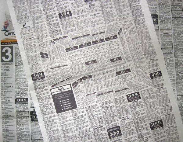
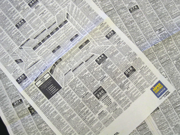
via My Modern Met
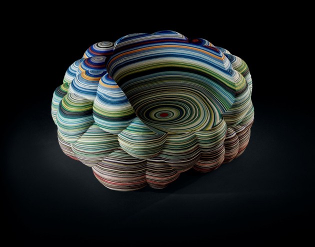
I am pretty obsessed with the Layers Cloud Chair by Richard Hutton. For each chair, the pattern is drawn out on the fabric, cut out using a CNC machine, and then manually assembled. The design references the pigments of layered rock found in Painted Desert, Arizona and nearly 100 colors were used to achieve the effect. love love love.
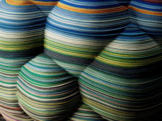

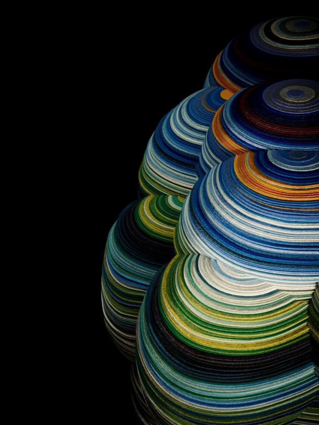
The chair will be at the Salone de Mobile as part of Kvadrat's Divina exhibition next month.
via Dezeen and Contemporist.
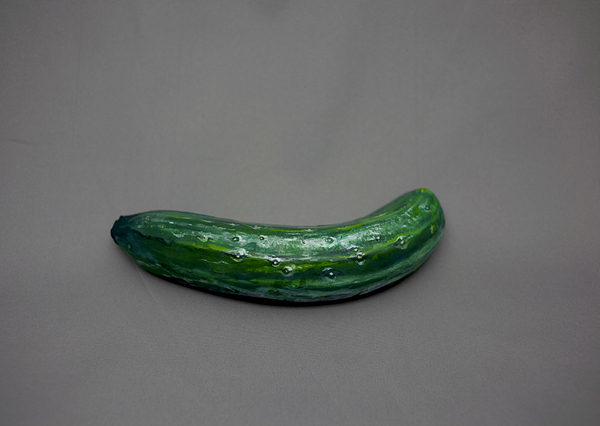
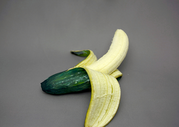
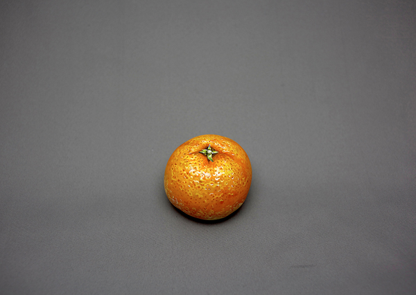
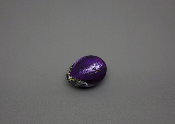
In the work below by Tokyo-born artist Hikaru Cho, she transforms one food into another using a photo-realistic application of acrylic paint. When you break open the cucumber, you realize it's a banana. When you slice into the tangerine, you find out it's a tomato. And when you pick up the eggplant, you discover it's actually an egg. In this series, aptly titled "it's not what it seems" she surprises us and makes us re-think what we are being presented with. I think this series is so fun, clever, and thought provoking. You can see more of her work on Cho's site. She has other really interesting work that involves things like zippers and electrical outlets on backs and arms or ear's painted on hands. It is definitely worth a look!


via Visual News
Archist City is a set of prints by Barcelona based illustrator Federico Babina that depicts architectural structures based on the aesthetics of famous artists. Each print focuses on a different artist and describes the artist's signature style using architecture. This is such a clever, imaginative and fun set of prints. Each time I see them, the make me smile. I haven't been able to pick a favorite yet, but which one is your fave?
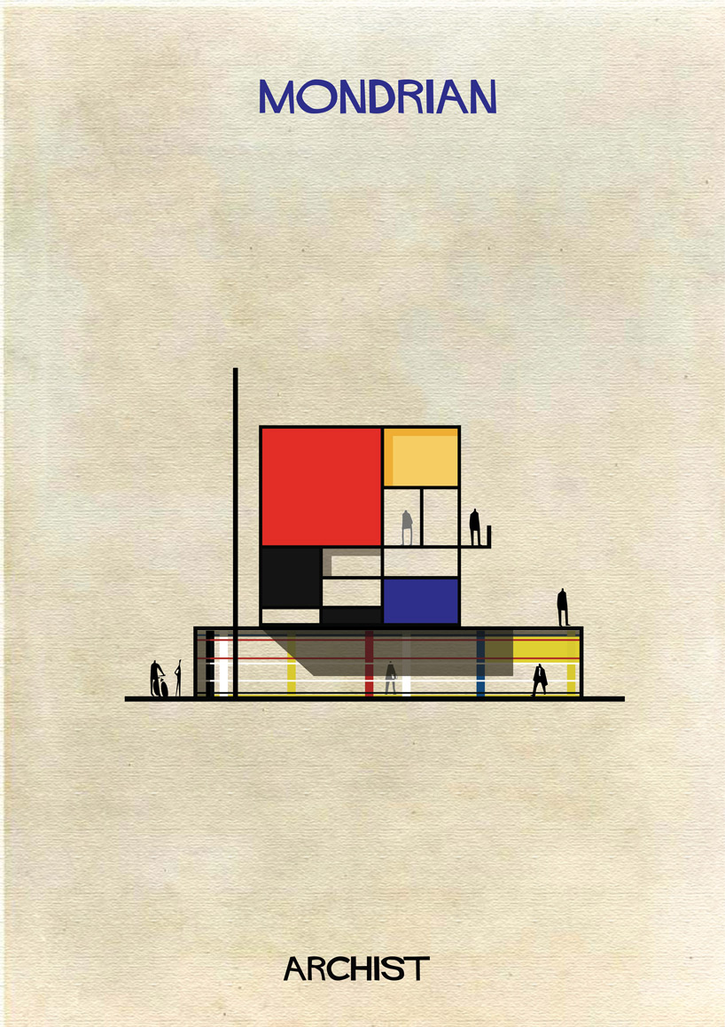
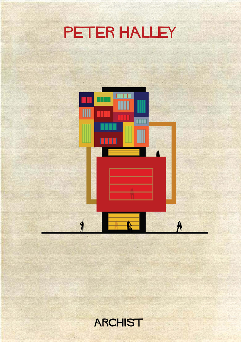
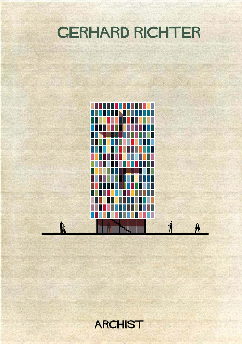

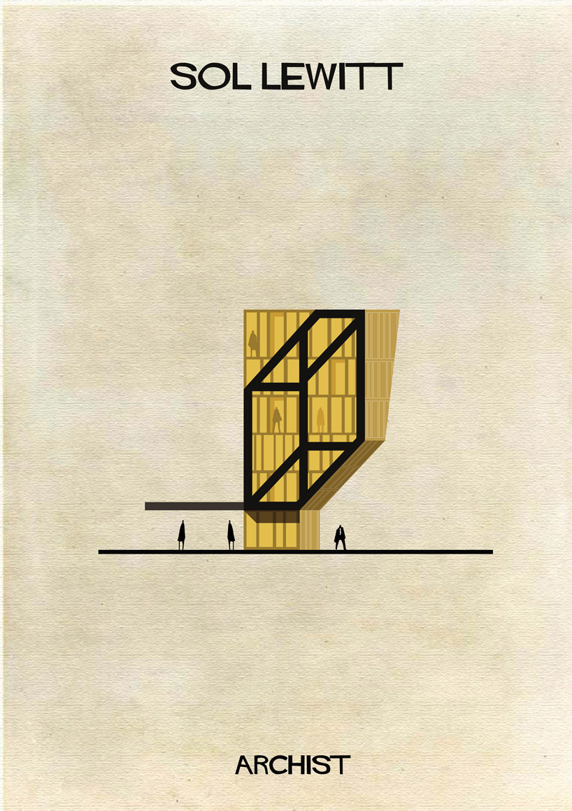
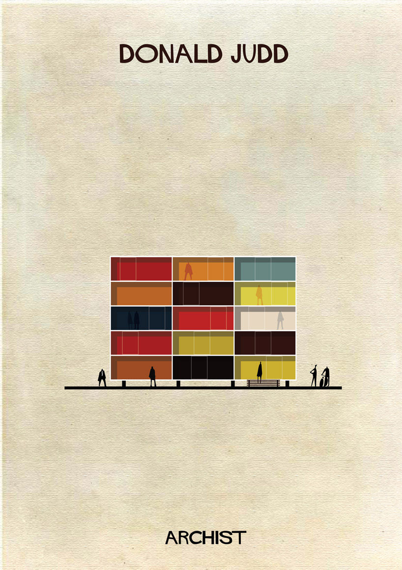

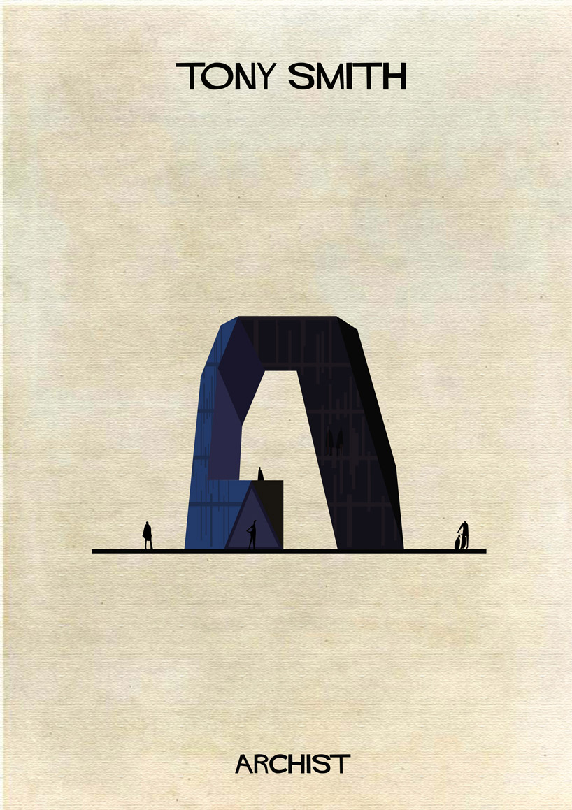
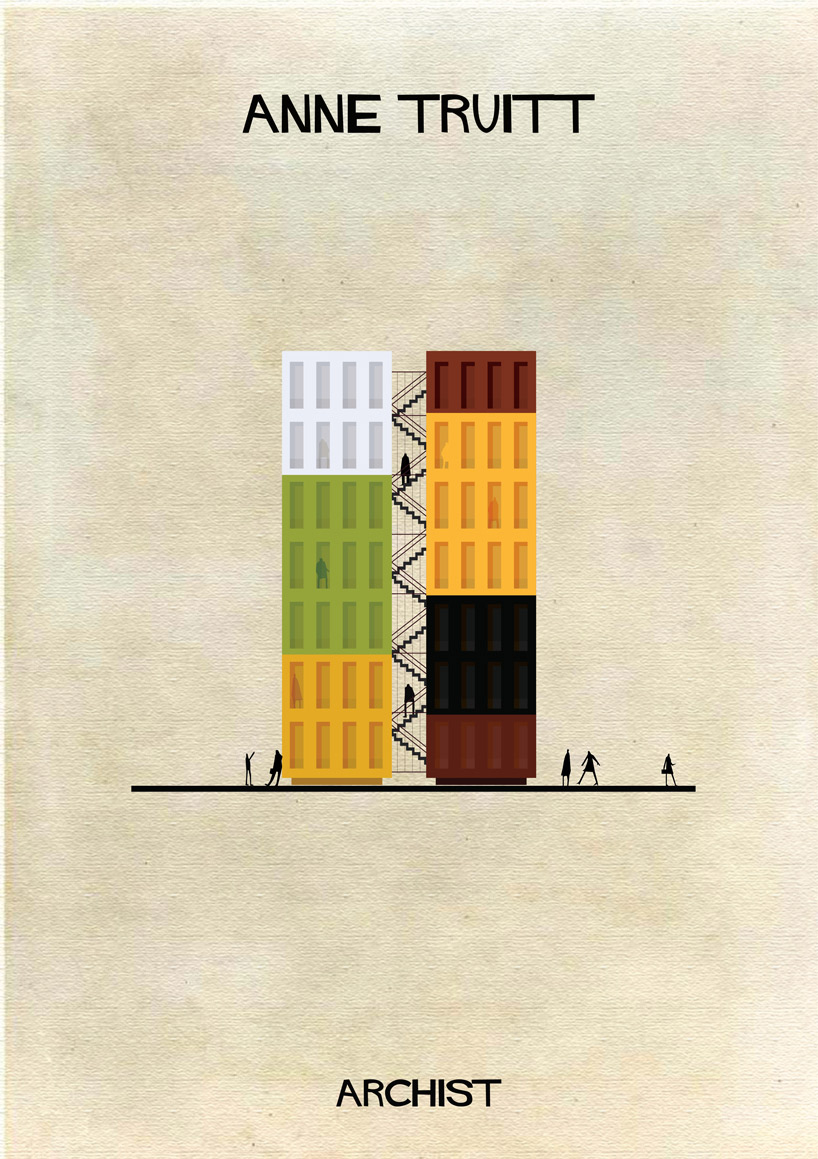


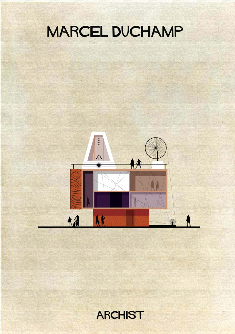

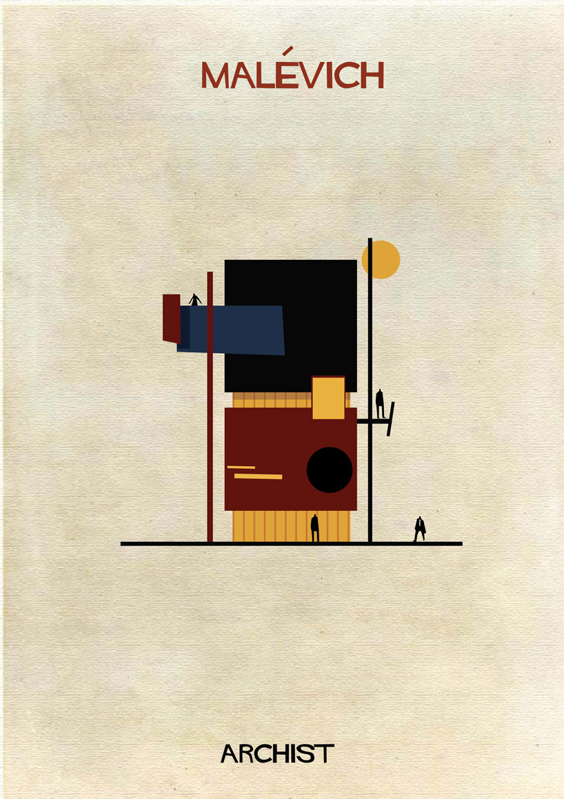
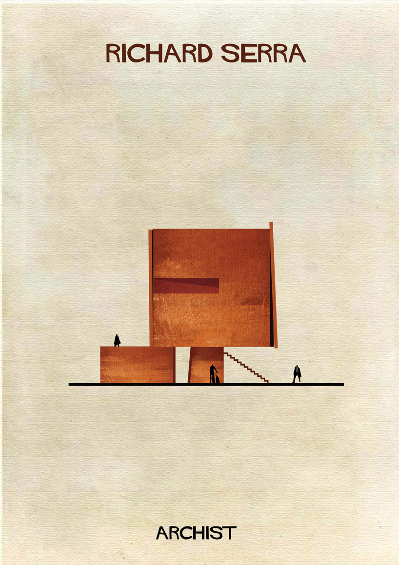
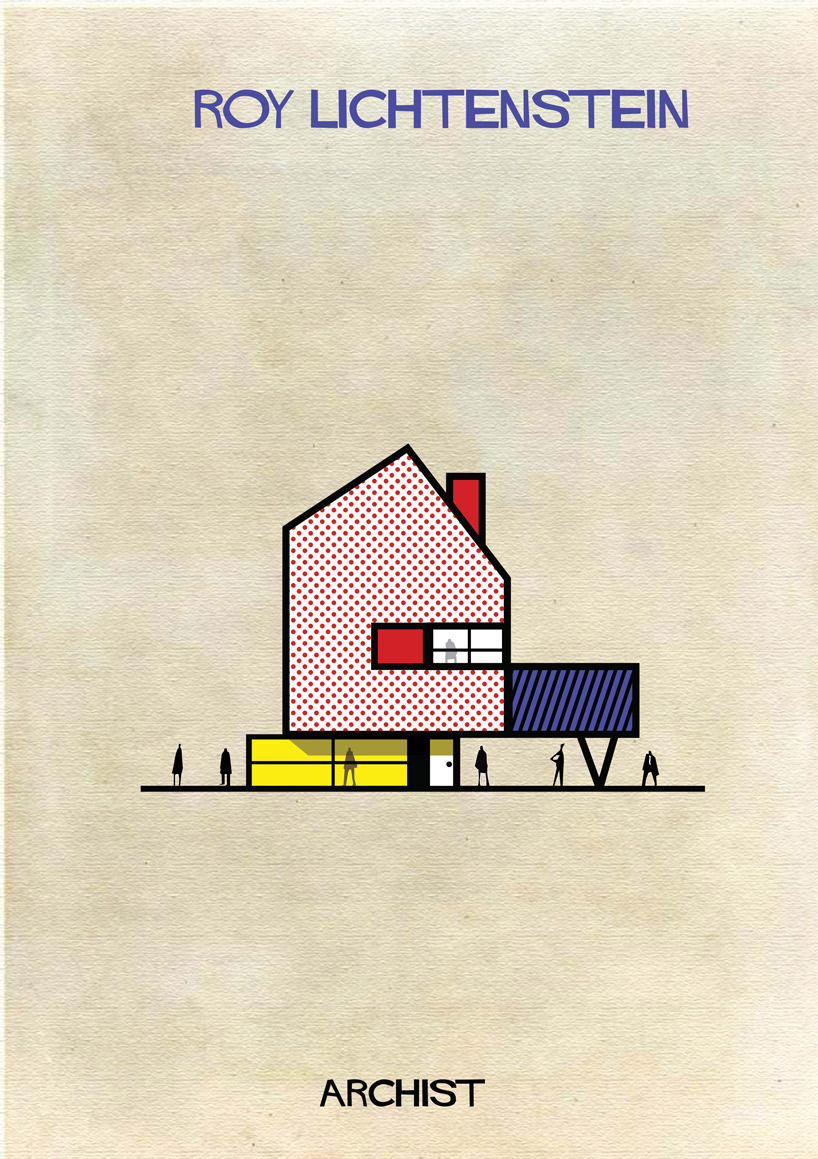
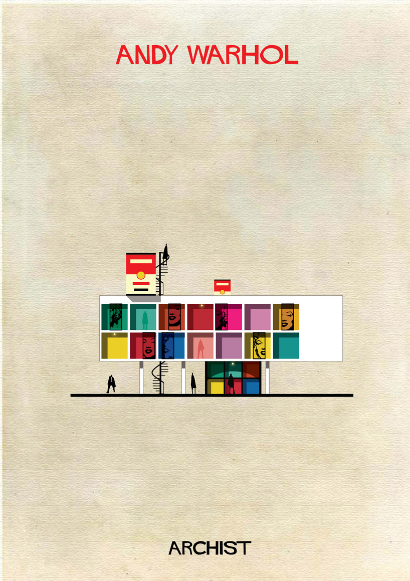
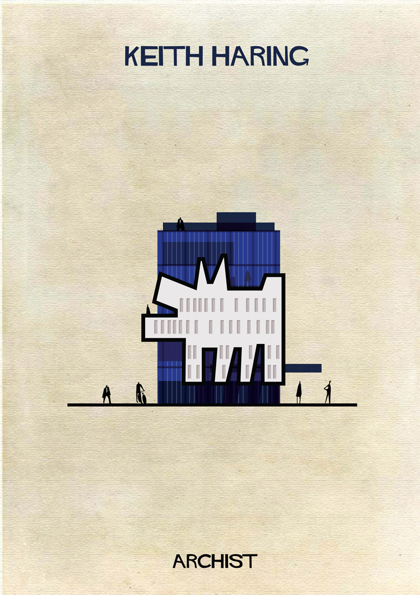
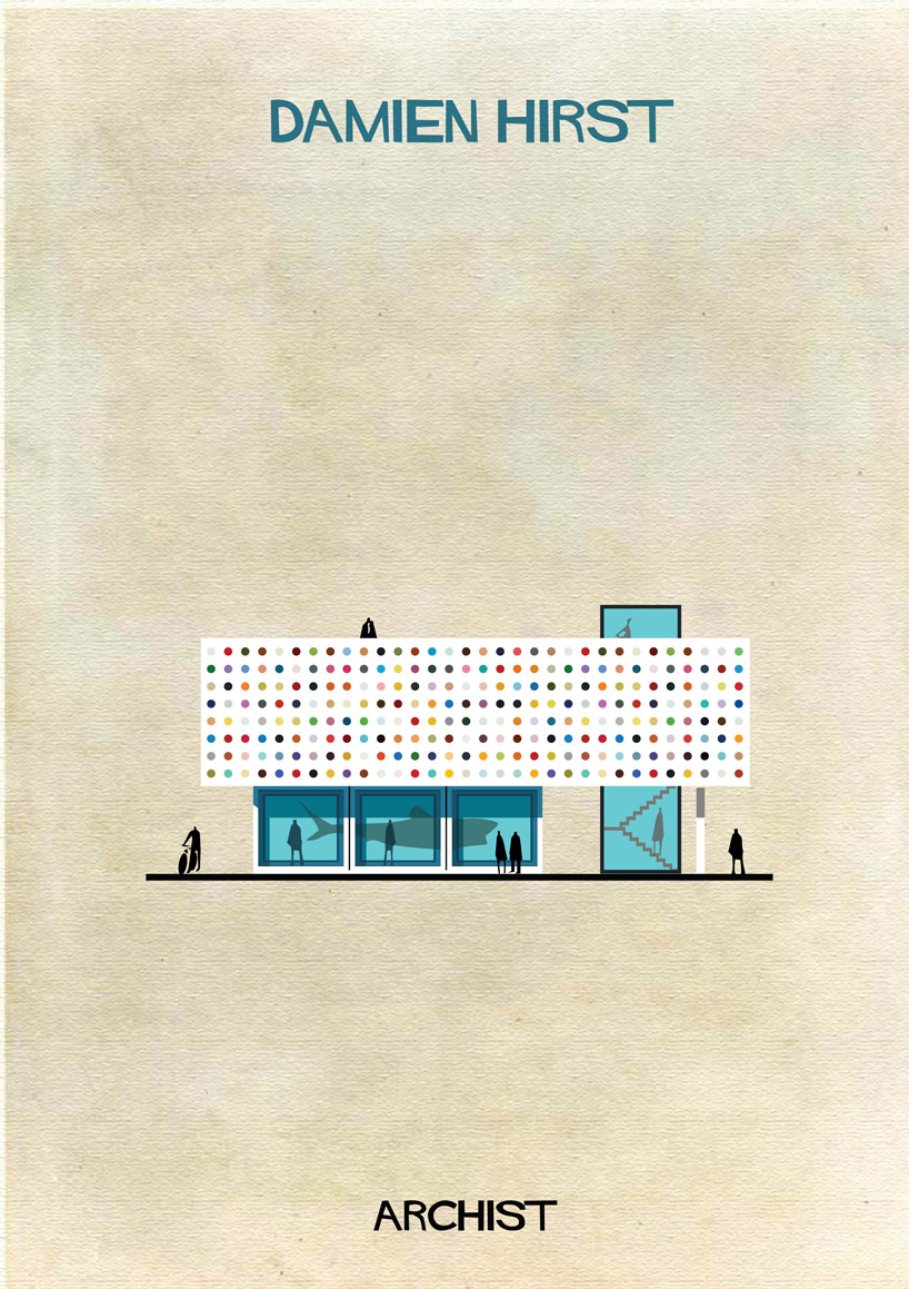
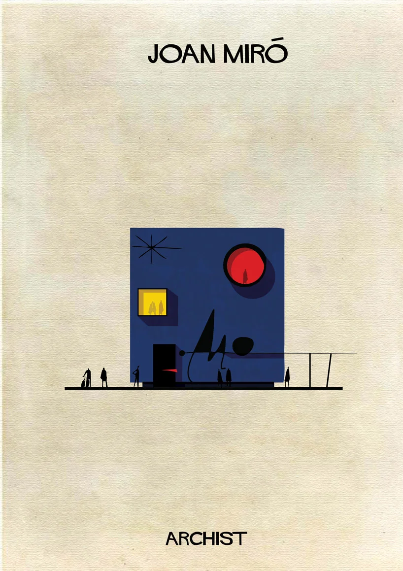

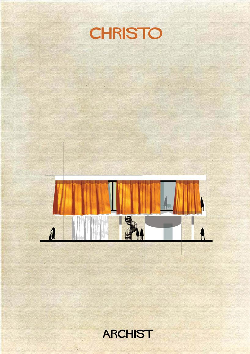

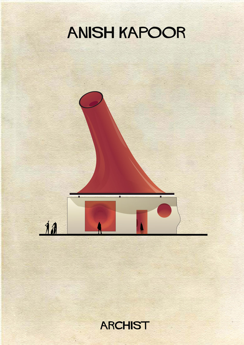


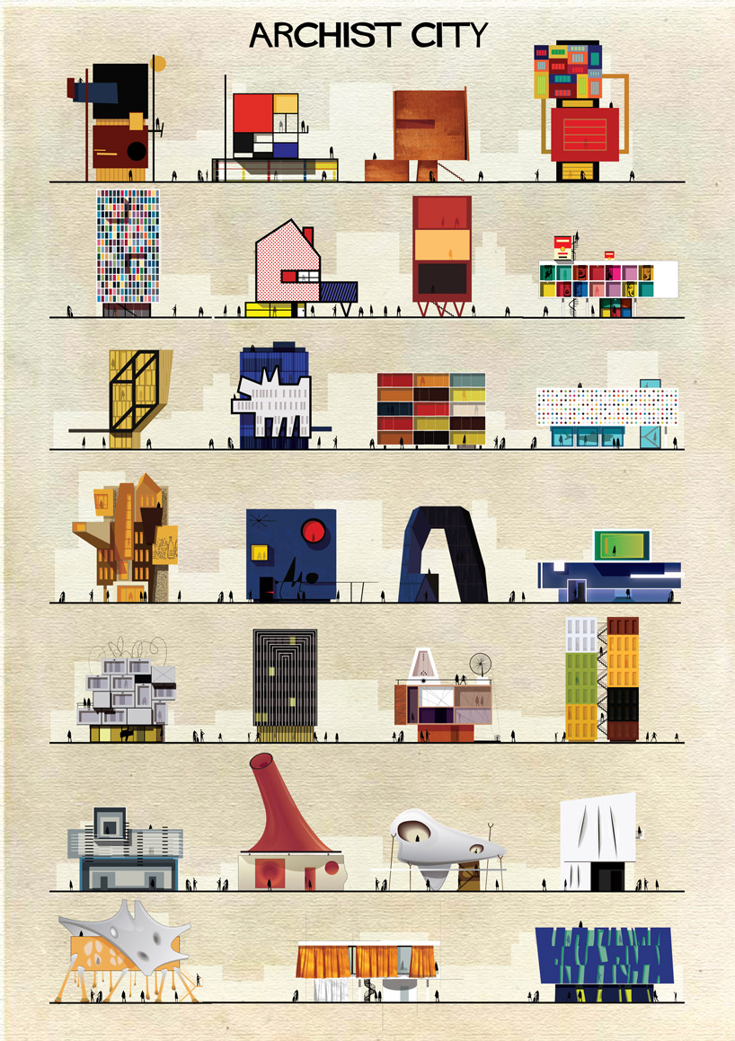
via Honestly WTF, Federico Babina, and Society 6.
In each of the pieces featured below, London-based Redditor shystone has ingeniously matched up 18th and 19th century paintings of specific places in London with the photos of how the city looks today. I love how the mash up allows the viewer to compare the architecture and surroundings of contemporary London with what these artists captured and observed centuries ago. This project was particularly suited to London, which has preserved so much of its architectural history, making it even more interesting to notice what stayed the same and what changed. The different scenes depicted around the architecture add another layer to the comparison by presenting the types of activities that occurred at those locations in the past, but placing them in the present. I have a particular fondness for the first match up depicting the Strand since I lived there in grad school!
I hope you enjoy these as much as I did!
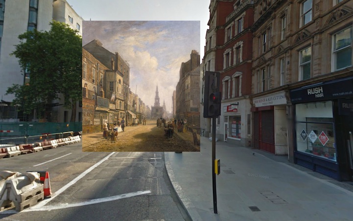
The Strand Looking East from Exeter Exchange (1822) by Artist Unknown
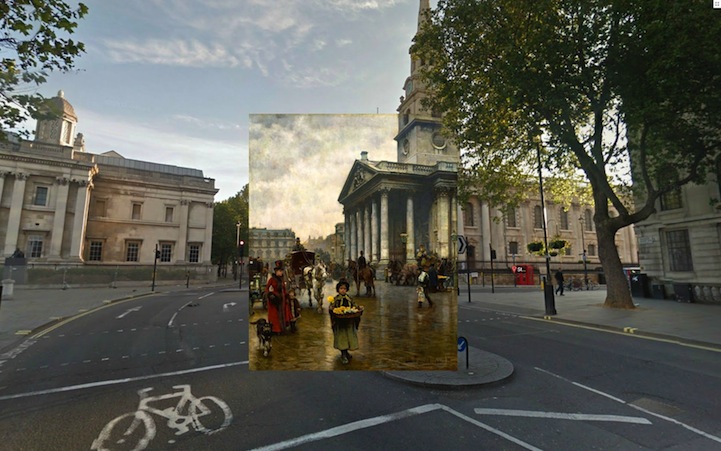
St. Martins in the Fields (1888) by William Logsdail

Northumberland House (1752) by Canaletto

The 9th of November, 1888 (1890) by William Logsdail

Westminster Abbey with a Procession of Knights of the Bath (1749) by Canaletto

The River Thames with St. Paul's Cathedral on Lord Mayor's Day (1746) by Canaletto

View of the Grand Walk (1751) by Canaletto

Covent Garden Market (1737) by Balthazar Nebot

A View of Greenwich from the River (1750-2) by Canaletto

Blackman Street London (1885) by John Atkinson Grimshaw
I thought this was so simple, and so creative, that I had to share.
Happy Tuesday!

seen on myvibelife
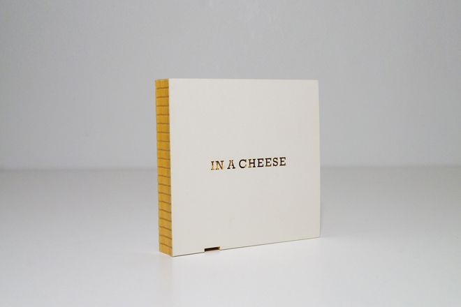
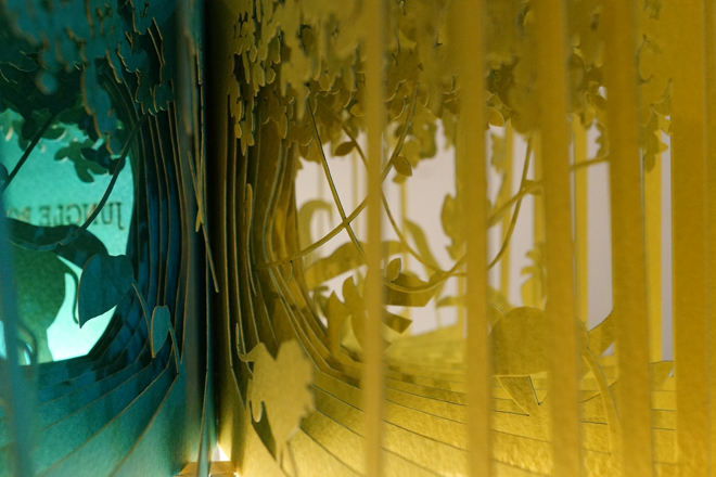
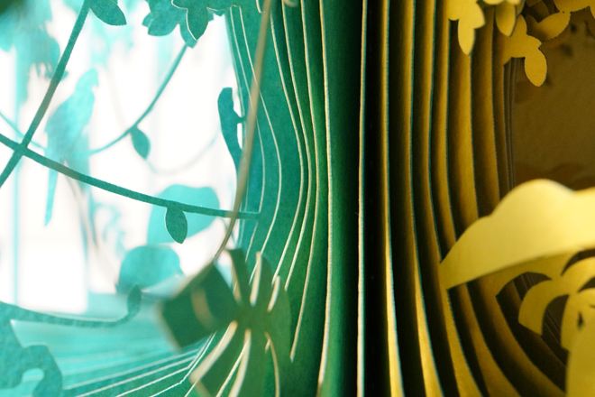
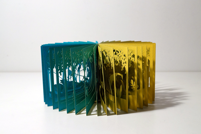
How beautiful are these paper books by Japanese graphic designer Yusuke Oono? Each 40-page book creates a visual narrative that illustrates a specific moment from a story. The books can be unfolded to be viewed in the round, giving the viewer a 360 degree view of the characters and scenery, or can be viewed flat, creating a diorama of sorts, that changes depending on the page you are on. The cut out forms and the negative space that these books create are gorgeous. I love how the dual colors of paper gives each piece depth and added interest. The amount of foresight to design a scene in the round, with each page of the book having to both work on its own, and fit in with the scene as a whole is really inspiring. I hope you enjoy them as much as I did!


via this is colossal. Images from here and here.
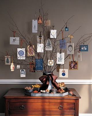
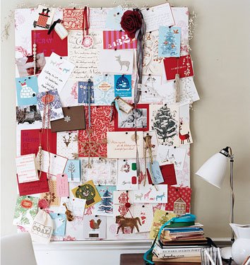
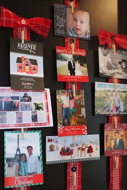
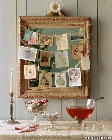
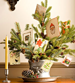
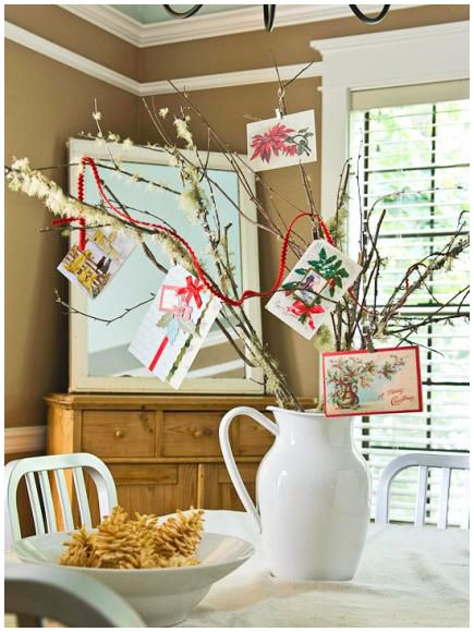
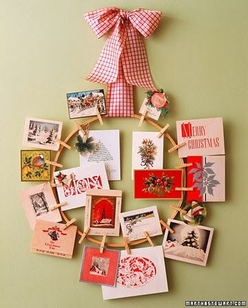
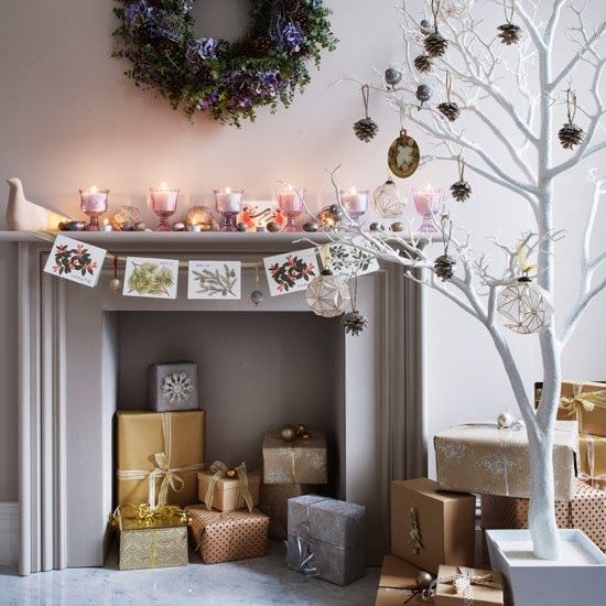
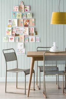
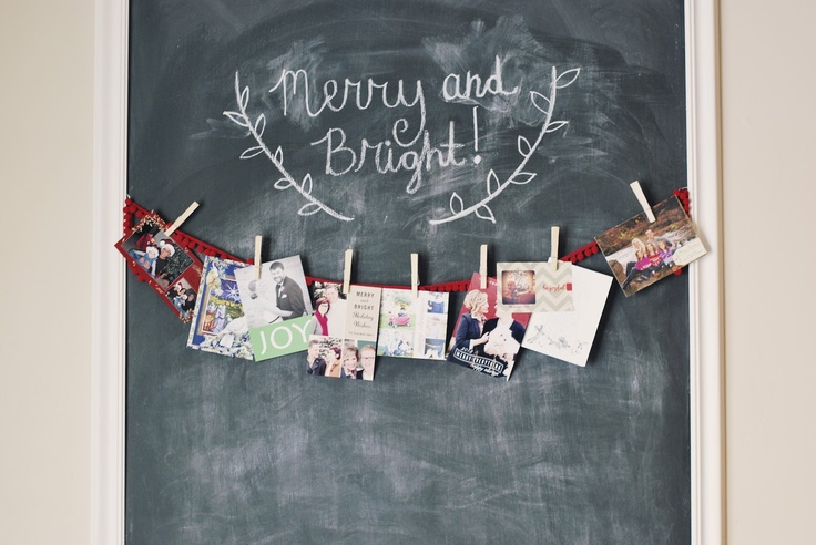
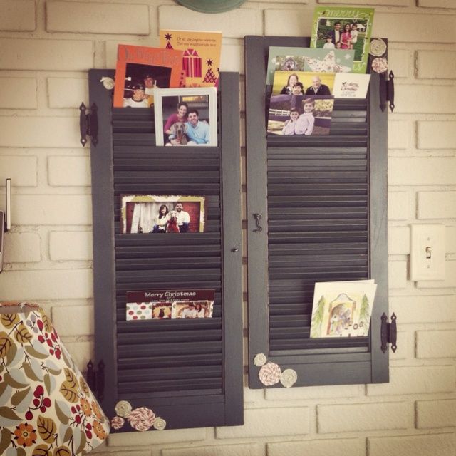
It's that time of year again, when Holiday Cards start pouring in from family and friends. Personally, it is one of my favorite things about the holidays and I love finding new and creative ways to display them. Besides brightening up my day when I pass the holiday greetings and well wishes from loved ones, they are a beautiful and festive looking decoration.
Do you display your cards? And do you have a preferred method?
xo, Meg
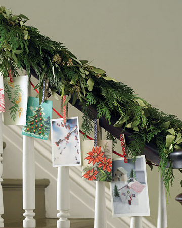
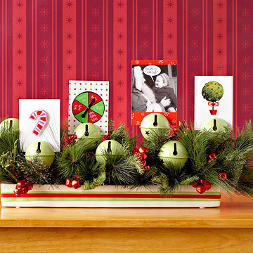
via Pinterest and Habitually Chic
When I saw these creative self-portraits by Ed Wheeler a few days ago, I couldn't help but smile! Wheeler takes iconic pieces of art and incorporates himself dressed as Santa Claus. In each piece, Wheeler not only positioned himself in a way that made sense, but he matched the tonal values, lighting, and in some cases even the brushstrokes, to the original. The end result is so much fun, and definitely got me into the holiday spirit. So amazing. Love it.
xo
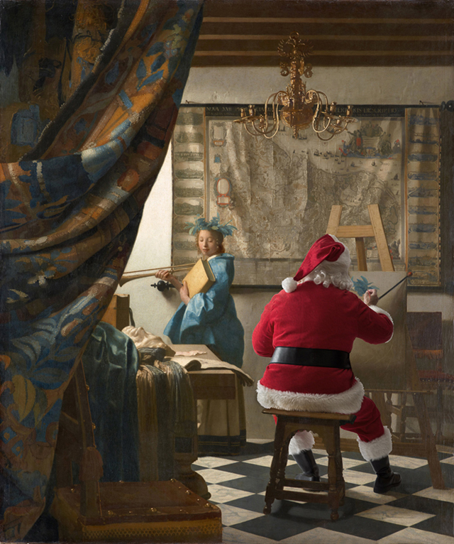

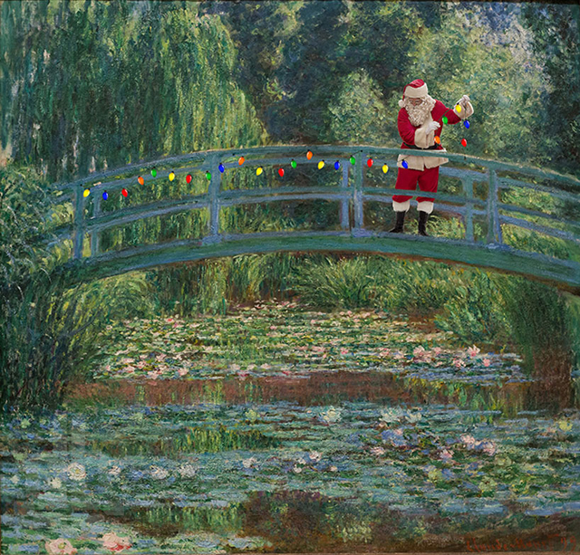

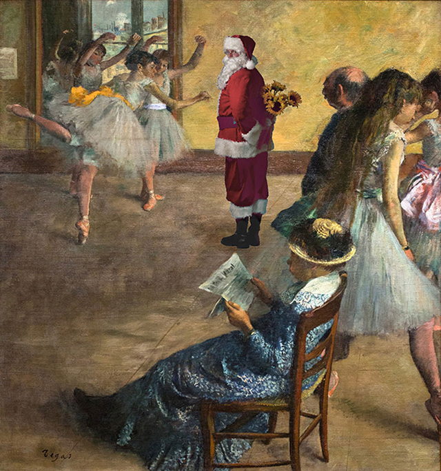
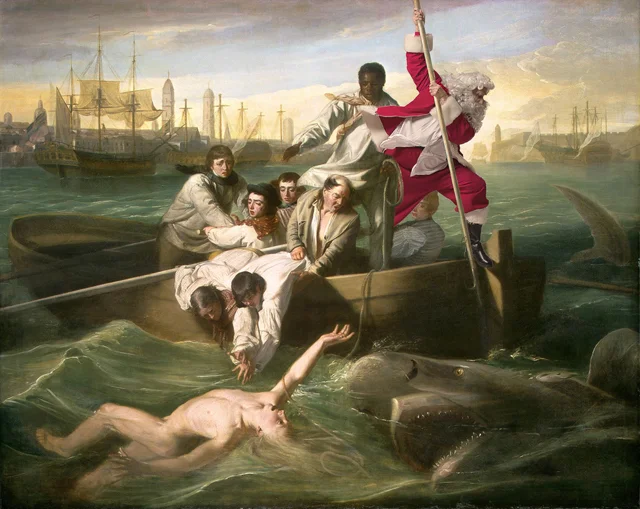
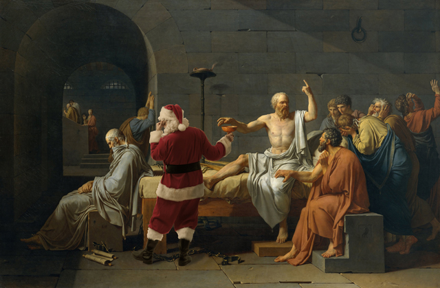
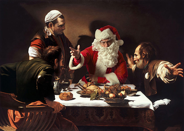
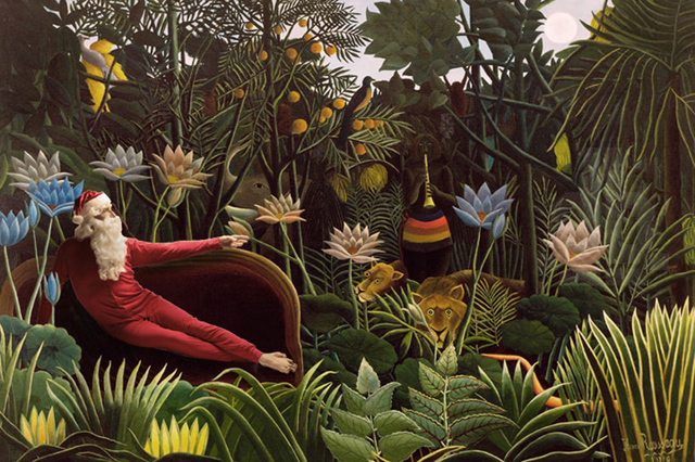
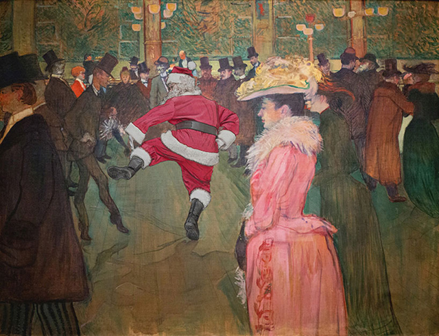
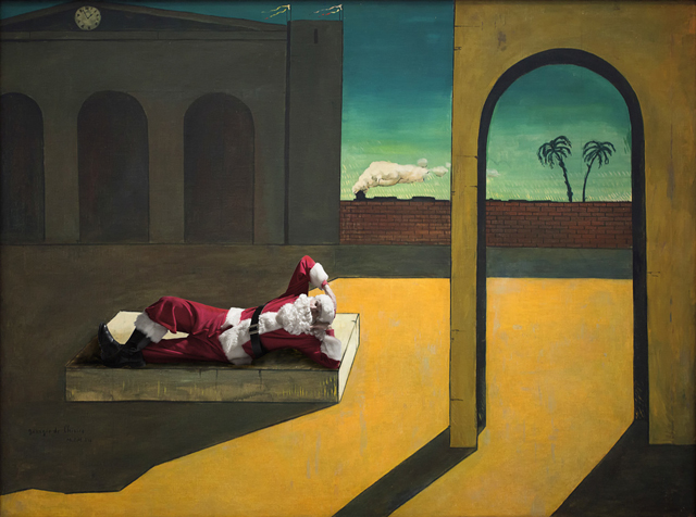
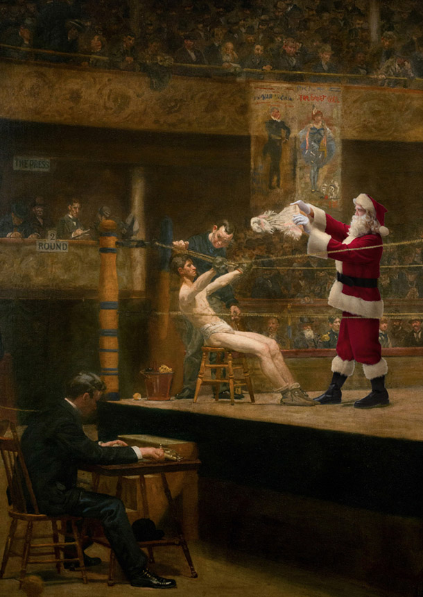
via Honestly WTF and the Ed Wheeler's Website
As a Christmas light fanatic, this story made me very excited and also a little jealous of all those who get to see this amazing light show in person! This year the Richards family set the Guinness World Record for the most lights on a residential property at their home in Canberra, Australia. Their elaborate, over-the-top display includes 502, 165 LED lights, that would stretch over 31 miles if they were laid end-to-end. The show is part of an effort to raise money for charity and will be on view for the whole month of December. From where I am sitting, there is pretty much nothing not to love about this; except for maybe the electric bill which clocks in at $2,291 a month. Luckily, a local power company is covering the tab.
I hope you love this light show as much as I did! It definitely got me even more in the holiday spirit!


via NPR and Laughing Squid

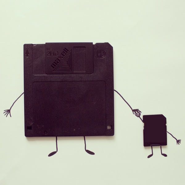
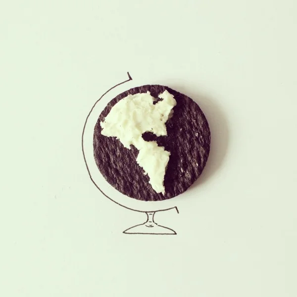
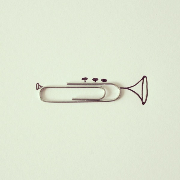
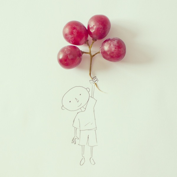
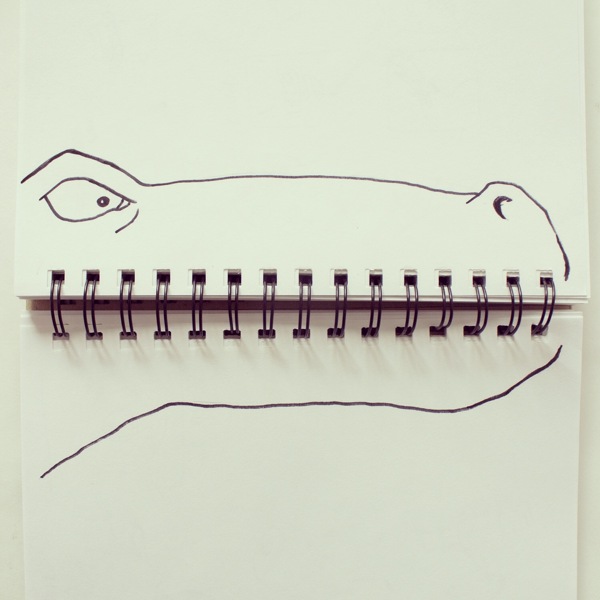
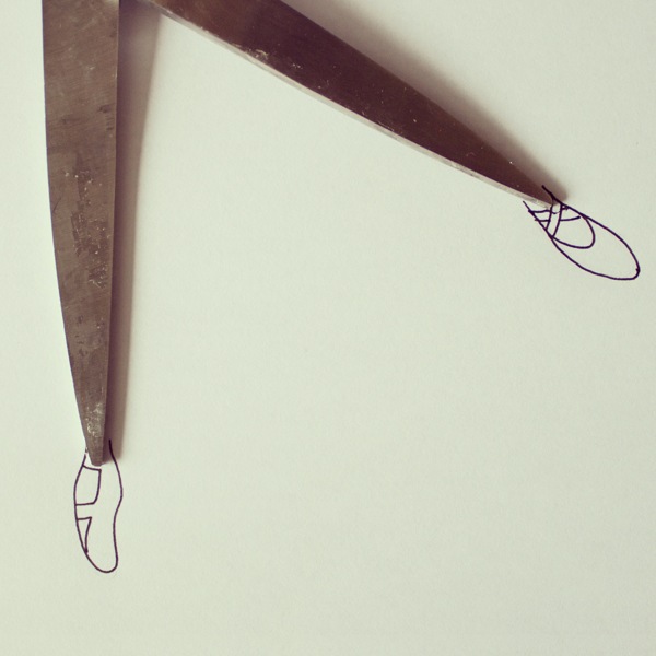
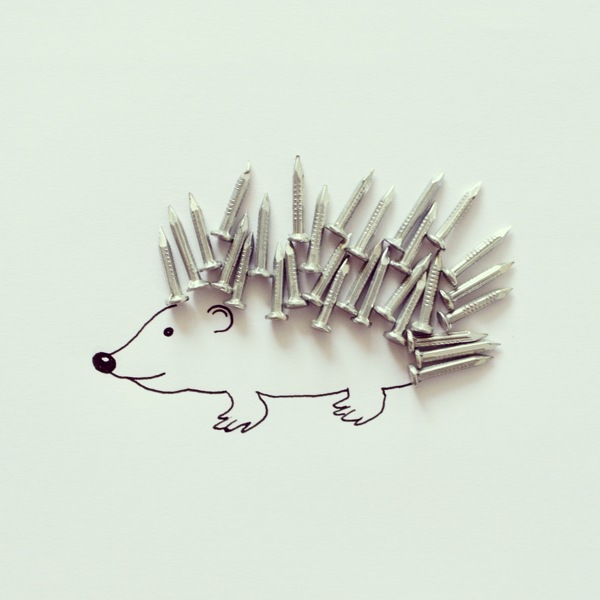
These quirky and creative illustrations by Javier Perez totally made my morning. He takes everyday objects and illustrates them using simple line drawings, resulting in these whimsical little scenes that he photographs and puts on Instagram. I think it is such a clever way to think about the objects we see and use in our everyday lives. Genius and totally inspiring.
You can find much more on his Instagram account. Fair warning though, it is very addictive.


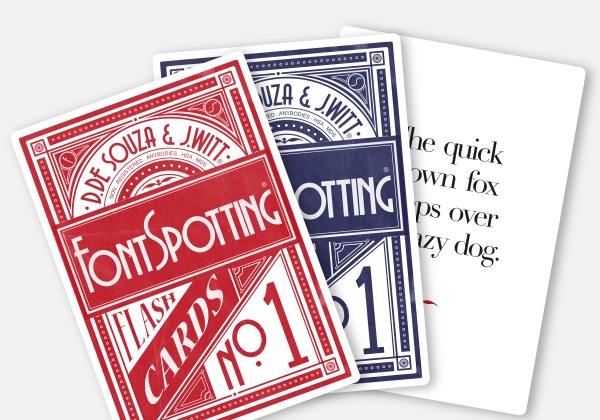
I have always loved fonts and typography, so the game Fontspotting is right up my alley. On each card, the front contains the common typographical phrase, "The quick brown fox jumps over the lazy dog" (a phrase my dogs take a offense to; they have assured me that this would never happen to them). On the back of each card it tells you what font the phrase is typed in along with a brief history. The best part is that it is free and downloadable. You can either review it on your computer or print it out and play at home. How do you think you'd do?
Fall has always been my favorite season and I feel like this year I am especially excited for everything that goes along with it: fall festivals, pumpkin everything and anything, apple picking/baking, scarf weather, beer tasting, trying new soups, and lots of strolling. Love it.
Hope everyone had a good weekend!
A little hump day fun. I am loving the Bibliothèque Méjanes in Aix-en-Provence, France and am now wishing more libraries/bookstores could be in the shape of books. It also makes me want to re-read Le Petit Prince.
Hope everyone is having a good day!
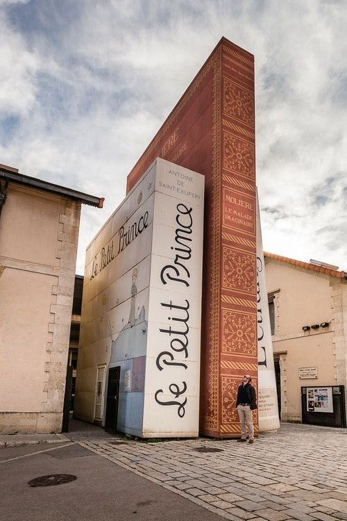
Bibliothèque Méjanes, Aix-en-Provence, France
Image from Pinterest.
I was so impressed by these animated beer labels created by Trevor Carmick. Not only are they really impressive design wise, but the GIF's are also a lot of fun and really breathe life into the characters on the labels. They also kind of make you want a beer, no?
I hope you enjoy them as much as I did!
See more of his animated beer labels here!


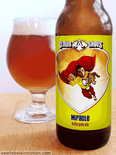

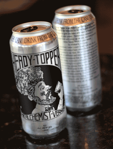
All images from http://beerlabelsinmotion.tumblr.com/
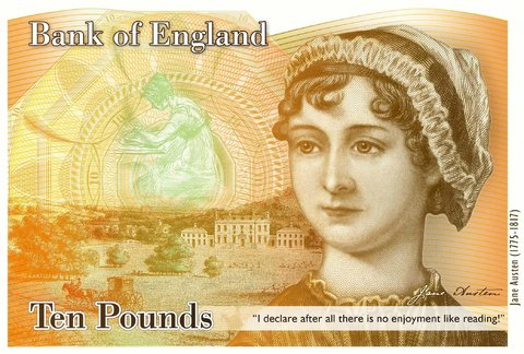
I know this is kind of old news by now, but whenever I see Jane Austen gracing the front of the 10£ note it makes me very happy. The fact that the new note, which will be introduced in 2017, also includes a drawing of Elizabeth Bennet from Pride and Prejudice, an image of Godmersham Park (a property owned by Austen's brother and thought to be an inspiration for her work) and and a picture of Austen's writing table is the icing on the cake. The unfortunate Caroline Bingley quote notwithstanding (and that will hopefully be replaced) it is pretty exciting. The only negative is that Darwin is being replaced. Somehow I have a feeling he will be back on some currency sometime in the future though. Happy Monday!